AAAAH!
 My Magi-Nation is showing! Nevermind. Character soup has many advantages as a cover illustration. First, It's an exciting way to show off multiple characters. You can suggest importance with size and location, and you can give hints on their personality traits by how you show them with each other. I feel like it's super complimentary to Manga storytelling, though you tend to find this style of illustration more often on the cover of video games. A lot of the time, Manga covers stick to just one or two characters either floating in antispace (the endless void of non-action), or hanging out with the logo. Hey logo, how's it going?
BUT THAT'S BORING.
I have a special relationship with negative space: I love filling it with things!! That, and when you use this kind of artwork, you're giving people a chance to get curious about these characters. If it makes you want to play the game, it ought to make you want to read the comic.
So while I'm singing the praises of this hyper-jumbly-horror-vacuui kind of artwork, I will also say that it's the biggest pain in the fanny to organize. The worst thing about it is definitely the limited usefulness of thumbnails, and I am a strong believer in thumbnails. Thumbnails keep you from cornering yourself in a funky drawing. Here though, they're only really good for organizing the heart of the image in relation to the rest of what will now become 'available space', which is how I start this kind of picture.
It's all about stragedy! I'll pick one aspect of the composition and made it 'immovable'. If you think about the character soup as being a tree, this part of the image is the trunk. The branches can wiggle around as much as they want, and they're going to want to. But this way, you've got something acting as a stabilizer to organize the rest of the composition around. The trick is making sure it doesn't accidentally sabotage the whole thing. You don't want it to look immovable, or it's just going to trap all of the weight of the image in that one spot.
Avalon makes choosing that core piece a little difficult, since technically there are at least 3 main characters. This shouldn't be a problem since each story focuses on them one at a time, but in the comic, there are several things going on at once. Who gets to be the middle? For the thumbnail at the very top of this post, I wound up going with the characters Emily, the healer mage, and Ozzie the ferret. Where the other girls represent two extremes, Emily is the middle ground. (She's also kinda my favorite, but you should never let stuff like that affect your work.) She and Ozzie are supa-friends, so of course they'd wind up in the same area of the picture. As it turns out though, it was more appropriate to have Kara and Donovan in the lead.
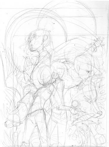
These are the bones of the first drawing. I began with Kara and Donovan, doing a similar back-to-back routine as in the first thumbnail, only I switched their positions so you would see the headstrong Kara Davies first, no question about it. Kara's pose is confident, inspired by a magical animal she's commonly associated with - a unicorn. It would not do to have the "Blazing Star" just standing there, she's all about bein' flashy! On the other hand, Donovan's character is steady and calculating, he's doesn't really get carried away even though he's just a kid. So for his pose, he's both feet on the ground, stable - nothing too twisty or crazy. The two characters lean toward each other, they're definitely friends.
But.. they don't have faces yet. Or hair. Or clothes. This first part is more about organizing movement rather than solidifying details, so it's all body language for now. It helps a lot with the next part, because with those two in place, it's time to start distributing the rest of the information around them. If you've already given them concrete details, like faces, you could wind up favoring that part of the illustration, and compromising the flow of the image. You don't want it to look like individual pieces placed together, you want each part to roll continuously into the next.
This gets tricky depending on the size of your picture, and the number of characters involved. For this piece, we needed Kara, Donovan, Adriane, Emily, Ozzie the ferret, Dreamer the mistwolf, Lyra the winged cat, Crumble the minion, and Frizzle the adorable minion. It's also important to show the Mages (and Warlock) with their magical effects, which means Adriane and Emily must have their right wrists visible and large enough to make out their magic jewels in their bracelets. Kara has to be showing off her unicorn jewel, and Donovan should be holding his sphere. Ozzie the ferret wears a jewel too, in his teeny tiny collar. All of this both limits how you're able to show them, and gives you a ledge to stand on. While you can't just have them doing whatever you want, that's a really good thing when you've got so many things to resolve in such a tight space.
In order to do this, I worked on everything else at once, going off of lines I made by extending the ones used to build Kara and Donovan's poses. A good tip to drawing these kinds of images: Don't ever draw a straight line. That's instant death. I mean you can make an exception if you've got a pole-arm or a sword in somebody's hand, but even then, a slight curvature gives you more to work with. Curves become circles and spirals, and those become new compositions within the big one. This strategy also keeps the main core of the image an important part of the entire piece without having it stick out oddly.
This helps get the ball rolling for sure, but it doesn't end here. Looking at the sketch up top, a lot of what's going on is perfectly okay so far. Crumble is in the lower right hand side of the composition, grumbling and sending magic to Donovan's sphere, and Frizzle is perched on his shoulder between his face and Kara's. That's a good spot for him, because he's very little, and we don't want him to get lost. I didn't want to blow him up and place him somewhere else in the image, as his size is actually an important character trait. Lyra's sinuous cat shape is near Kara's, excellent, she's her bonded. I got lucky with her big kitty wings, they create two new arches that will later help keep certain parts of the composition from getting too close for comfort. Lyra's left wing also creates a cute tangent with Kara, it almost looks like it's hers.
Then, there are the problems. Emily's in a good place at the upper left, but so far Ozzie isn't cooperating, and I really want them near each other. I like Adriane and Dreamer filling the space on the right, but they're not flowing together just yet. Worse is what kinda looks like Donovan sprouting a gigantic Adriane from his torso, and Dreamer's gigantic random head, although I like the direction he's facing. It compliments Lyra's on the other side of the image. Finally, Adriane's bracelet is on the wrong wrist. Whups! That's okay, it's plenty enough information to go on.
I started out focusing on the areas that needed the most help, so the right side of the picture was up first. I erased and redrew Adriane's figure so many times It started screwing up the surface of the paper. It seemed like no matter what I had her doing, she was still either growing out of Donovan or elbowing Dreamer in the head. I finally switched it so that Dreamer would be overlapping her instead, and that's when things started looking up. It reshaped that section of the piece, and made it more comfortable visually to change the angle on Adriane so she could finally start looking more like the fierce warrior she's meant to be. It also opened up a new directional agent and the last piece of the puzzle - Adriane's hair. With something leading the side of the picture to the top, there was suddenly space for Ozzie the ferret.
After that, it became a case of hopping around the composition and developing everything as simultaneously as possible. This way everything shines together. The final part was adding textures to the empty spaces in order to suggest either some kind of environment, or something iconic of the character it was near to. Lyra is pawing through a wavy glade, the grass growing almost fire-like - Kara's element is fire. Likewise, there are stones near Adriane, who's element is earth, and a special kind of magic flower arranged in a circular motif near Dreamer, who's a magic tracker. The top of the composition contains two hoops, each one will frame a design by the time this piece is finished. Leaves of the Ravenswood forest finishes off the empty spaces left.
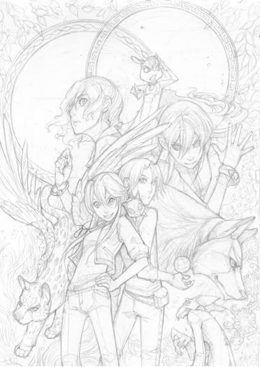
So there it is! Timewise, this piece went extraordinarily slow. Additionally, it's probably going to change a lot from here on, so it's really important to not get overly attached to any one phase of the game. I'm really proud of how this sketch worked out anyway, I can't wait to see where we go with it from here. More soon, thanks for reading!
Wow, thanks for putting the time into doing all this o.o; I really enjoy your finished works at deviantart, but it's always nice when you get the chance to get a glimpse of another artists' way of getting things out of their head onto the paper. Anyway, thanks again for writing this! ^_^
ReplyDeleteThat was great to read; I love reading about other artists process, especially one's I'm personally friends with, haha. I hope there are lots of posts to follow! The sketch turned out beautifully and it was inspiring to read how you worked through it. God knows how many times I've tried to do this sort of large scale multiple characters thing and gotten so frustrated I just had to stop. One day! Ooone day.
ReplyDeleteThat was an amazing read ;A; Your thought process was a wonderful thing to include ... it inspired me more than an image alone would. The little hints were valuable, as well. Thank you for taking the time to write this. ♥ It will make my day a whole lot more arty *hunts for drawing board*
ReplyDeleteThis was really informative and interesting to read. This will definitely help me when I try to compose a big image and whatnot.
ReplyDeleteI will be bookmarking this site and visit more often!
Oh. My. Gawd. A few entries into poking through your blog I realized that you're talking about the same Avalon books I read to death a handful of years back. This is hilarious, awesome, and surreal at the same time.
ReplyDeleteBy the way, I love seeing your process, too.