Monday, July 26, 2010

The Warlock Diaries - edits and "inks"

Y Halo Thar!

It’s been a little while, time for some updates on the cover for the Warlock Diaries. I’m well into coloring this guy, but I need to organize the screenies I’ve been taking. I’m hoping to be able to make a post about that part that actually makes sense. I sort of shut down when I’m coloring, it’s my zen.


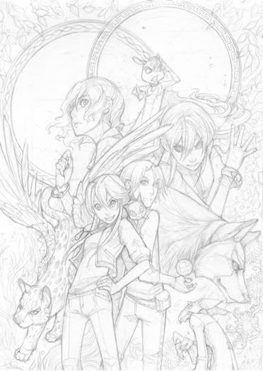
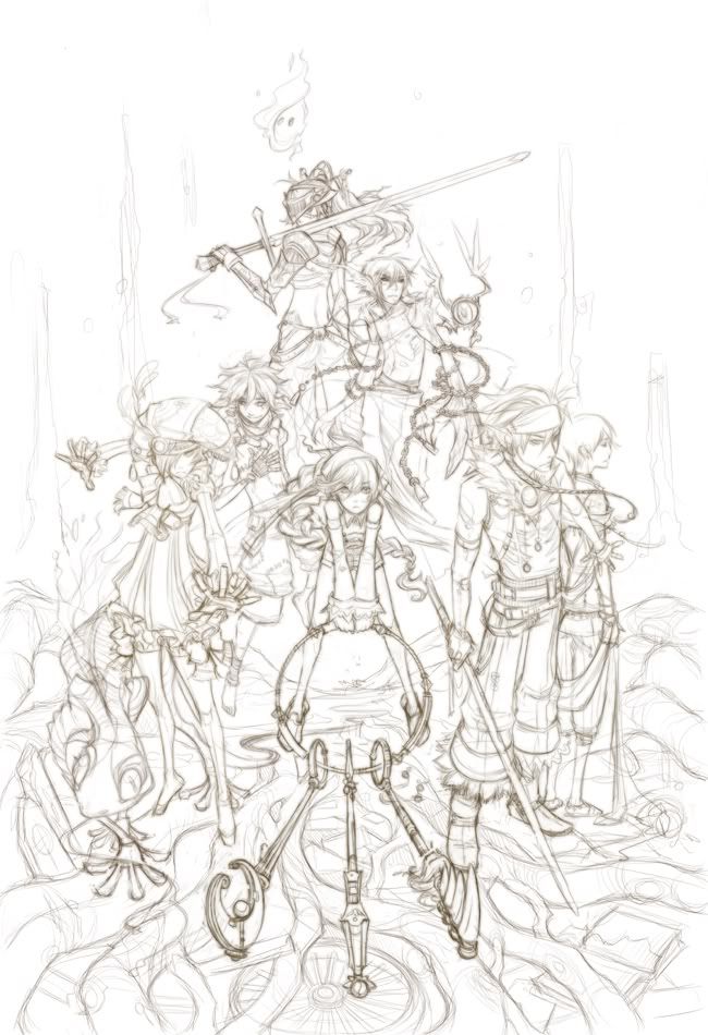
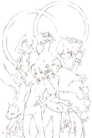
So here’s the drawing pre-feedback, as it was sent in, fully ready to be collapsed and restructured should the need arise. That’s how it goes! In the past, we’ve even finished the entire cover only to go back in and do it over again completely. It’s actually pretty neat to get to see the before and after, but it is time consuming to the extreme. Because I am a slow colorist to the extreme. But! Good news, that won’t be necessary. This sketch did fine. So far the concerns have been about making Kara and Donovan’s sizes match Emily and Adriane’s more, and regarding the lack of ….sparklies.


Sparklies?! in my Avalon art?!?


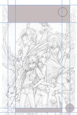
Oh, yes. There will be sparklies. Sparklies, there will be. Train of thought.. Hi! Okay anyway so that was the first bit, and that’s not so bad. We’ve got the power of Photoshop! More importantly, from the get-go I had been observing the wrong format. I’d drawn this cover along the same size dimensions as the novels, not realizing that the Manga was going to be different. D’oh!


I opened a blank document in the correct size, and used the rulers in Photoshop to divide it up based on where all of the text information was going to go, approximately. I have the first volume in the Warlock Diaries, so I measured that one IRL and just replicated it in my computer. I shadowed those places in, so I wouldn’t accidentally stick somebody’s head in there during the great rearranging.


Yup, Ozzie’s cute little ears are in danger. No good! We can’t just make the front two characters big, either. The changes to be made here will need to occur over the whole sketch in order to maintain balance within the new dimensions. I cut the whole thing apart.


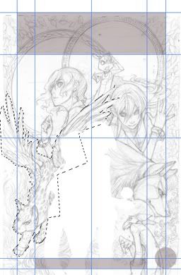
This is one of those times I wish my tablet were slightly less sensitive on me. I traced around each character roughly with the polygonal lasso tool, cut them from the sketch, and pasted them on their own layers so I could transform (cntrl+t) each portion of the composition as needed. It just needed to be sorta ballparked; with this method you have to accept that some areas are going to get covered, and some things are going to need to be added. The important thing is that everyone still fits and respects each other’s space.


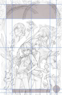
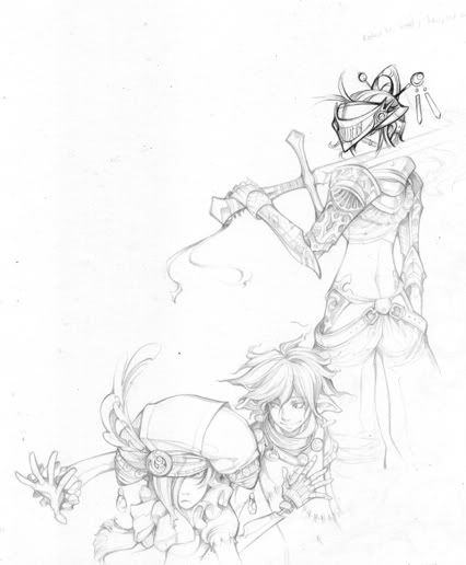
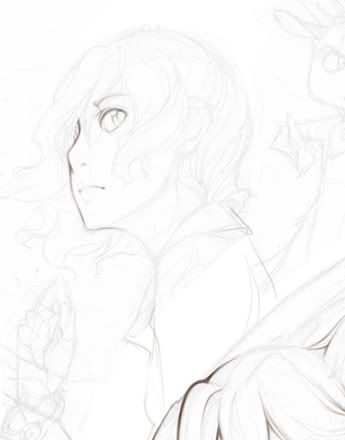
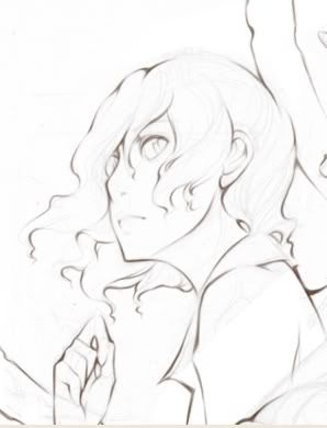
After much wiggling around, this is what gets to go to inks. The only part here that leaves me sorta ‘eh’ is where Lyra’s wing is riding right on Kara’s bangs.. I don’t like those edges meeting like that. The kitty cat’s wings are going to get fancier, so for the time being, I’ll leave that as is. Inks must happen! *shudder *


Go go gadget lineart sort of! I use Open Canvas 4+ to ink digitally. Photoshop does make for a silkier, more solid line, but it also takes about 3 times longer in my hands. OC just feels more like tools, and boy does it come with a lot of them, except I think I only use this program for the pencil tool. Honest. The thing is the most genius instrument of digital art making ever designed. I want to marry it. You can graze the surface of your tablet to build up a mark on screen, and you can also make it extremely wide, so it’s not just a teeny point.


My linework acts like a stabilizer, it’s not exactly useful on it’s own. It lacks most of the sketch’s original detail and it’s confusing to look at. It’s pretty gross, but it best supports the way I use watercolor, which was influenced by the way I color digitally. Since it works so well on paper, I started trying to replicate the look in open canvas whenever I’m cornered into inking something digitally.


Pencil tool to the rescue! I don’t really know how to describe this other than make a new layer over the sketch, think ‘brush’, and go with it. It feels pretty natural, except you don’t have to stop to re-water/ink, and it never gets scrumbly (that thing where you run out of water and it.. yeah.) Corners melt together and keep rolling. Angles are deliberite, lines fade to finish and never stop abruptly. Continuity is key, keep it thick and soft.


I finish my lineart by duplicating its layer back in Photoshop, and blurring the bananas out of one of them before merging them together again. I just don’t want it to come out too sharp or too strong, it’s going to sit on top of the colors awkwardly. This needs to melt into them and guide their edges, entire sections will probably get blended straight into the painting later.


More very soon, thank you for reading! :3

Sunday, July 11, 2010

Ancient Artifacts - personal project

Hello Planet!
Here's an image I started in June. (If you click it, you can see it larger) My own projects go pretty slowly since they've got to share time with the ones I take on for work. I've got no shortage of WIP's!! The difference is this one is "active", which means whenever I can snag two seconds here or there, this is the one that gets worked on. It's sort of like having a 1500 piece puzzle around.

If you know who these guys are, you've known me for about 6 years. I decided to start building this illustration because I wanted to pay homage to the first story I ever constructed that had a beginning, a middle, and an end.

So I dug everybody up for one last group shot. Or rather, if there will be others, it's probably going to be quite some time. I know this one's just gonna crawl to a finish.. but it's dear to me, it'll get there. eventually. I thought it'd be fun to start posting on it, since we're sort of on the subject of multi-character pieces at the moment with the Avalon one and all.

I don't consider this character soup, actually. The difference for me is that we've got all of the characters together on one fairly believable plane, warped of course to suit the needs of the composition. (note that the knight at the top of this dog-pile is somehow floating?) I tried to set everyone up according to their character's roles, but in such a way that it feels like they're all sharing the same moment together. The theme of this entire story was pretty much one of those 'preventing the apocalypse by narrowly heading it off at the pass' kinda deals, so everyone is tense, standing at the ready. Except for Vice. I don't even know what his deal is, but that's him in a nutshell.

I arranged this sketch digitally, since I neither had a large enough piece of paper to draw this on or a big enough scanner to make drawing it by hand very sensible. This was hugely helpful, it meant I was able to use selection tools to chop stuff up and move it around. As certain parts of this developed, it would get unbalanced.. that's actually why we have the big bug-eyed lizard on the left, hanging out with the angry girl with the fancy croissant on her head. (I believe this explains why she is so angry.)

But! I hate inking digitally. Sketching digitally isn't too bad, I don't do it if I can avoid it. Truthfully, it's a clean and hurt-less way to set up a busy composition, but I like the feel of a pencil. Graphite kicks butt!! In the same way, I really, really dislike inking digitally. I've never been very good at making it look lively unless I created very quick lines, at which point the quality of the whole piece would sort of die. Actually, I don't like inking much at all. But that didn't stop me from trying.


First plan of attack: blow the digital sketch up real real big, and print it out in 4 parts. I figured if the lines were only light enough for me to just barely make out, I could re-draw the whole thing in ball-point pen. In four pieces. ...Yes. I started with the knight's head in ballpoint, then got another idea and decided to do the rest in pencil so I could create a greater range of tone for shading. The tip of the mechanical pencil is a lot smaller than the ballpoint pen's, and I don't have to fight it to make a mark. I would finish each section this way, scan the parts in, reassemble them, and oh my god this was a dumb idea.

FAIL!

This tiny part of the image took a really, really long time to render out with pencil. Once I got to another section, I couldn't make the marks match the detail from this side, and they wound up looking strange together. The final blow was when I discovered that I'd done all of the nicest work on a piece that got printed out slightly too small, because I'd neglected to check a setting on my printer, so I wouldn't be able to match it up to the others while I was working on them anyway.

Ahwell, it was a noble effort. Kinda stupid, but noble. I guess I figured I do graphite transfers like this all the time, so it would be the same difference as long as I was careful. That's okay though. I've got another plan. I experimented with this on a piece I just finished, and it didn't explode. This one here is more complicated, but the same rules from before ought to adhere- I'm gonna kill the ink stage completely >: (

Round 2, you scurvy dog you! *shakes fist*
More soon, thanks for reading!

Saturday, July 10, 2010

The Warlock Diaries - Makin' Character Soup

Hello planet! Today we're making character soup for real, though technically this piece was made yesterday. Posting was derailed by plans to play a video game about bein' some doctors. Eye'm a doctor now. Thanks Nintendo! So slightly reheated character soup today, sorry.

AAAAH! My Magi-Nation is showing! Nevermind. Character soup has many advantages as a cover illustration. First, It's an exciting way to show off multiple characters. You can suggest importance with size and location, and you can give hints on their personality traits by how you show them with each other. I feel like it's super complimentary to Manga storytelling, though you tend to find this style of illustration more often on the cover of video games. A lot of the time, Manga covers stick to just one or two characters either floating in antispace (the endless void of non-action), or hanging out with the logo. Hey logo, how's it going?

BUT THAT'S BORING.


I have a special relationship with negative space: I love filling it with things!! That, and when you use this kind of artwork, you're giving people a chance to get curious about these characters. If it makes you want to play the game, it ought to make you want to read the comic.

So while I'm singing the praises of this hyper-jumbly-horror-vacuui kind of artwork, I will also say that it's the biggest pain in the fanny to organize. The worst thing about it is definitely the limited usefulness of thumbnails, and I am a strong believer in thumbnails. Thumbnails keep you from cornering yourself in a funky drawing. Here though, they're only really good for organizing the heart of the image in relation to the rest of what will now become 'available space', which is how I start this kind of picture.

It's all about stragedy! I'll pick one aspect of the composition and made it 'immovable'. If you think about the character soup as being a tree, this part of the image is the trunk. The branches can wiggle around as much as they want, and they're going to want to. But this way, you've got something acting as a stabilizer to organize the rest of the composition around. The trick is making sure it doesn't accidentally sabotage the whole thing. You don't want it to look immovable, or it's just going to trap all of the weight of the image in that one spot.

Avalon makes choosing that core piece a little difficult, since technically there are at least 3 main characters. This shouldn't be a problem since each story focuses on them one at a time, but in the comic, there are several things going on at once. Who gets to be the middle? For the thumbnail at the very top of this post, I wound up going with the characters Emily, the healer mage, and Ozzie the ferret. Where the other girls represent two extremes, Emily is the middle ground. (She's also kinda my favorite, but you should never let stuff like that affect your work.) She and Ozzie are supa-friends, so of course they'd wind up in the same area of the picture. As it turns out though, it was more appropriate to have Kara and Donovan in the lead.


These are the bones of the first drawing. I began with Kara and Donovan, doing a similar back-to-back routine as in the first thumbnail, only I switched their positions so you would see the headstrong Kara Davies first, no question about it. Kara's pose is confident, inspired by a magical animal she's commonly associated with - a unicorn. It would not do to have the "Blazing Star" just standing there, she's all about bein' flashy! On the other hand, Donovan's character is steady and calculating, he's doesn't really get carried away even though he's just a kid. So for his pose, he's both feet on the ground, stable - nothing too twisty or crazy. The two characters lean toward each other, they're definitely friends.

But.. they don't have faces yet. Or hair. Or clothes. This first part is more about organizing movement rather than solidifying details, so it's all body language for now. It helps a lot with the next part, because with those two in place, it's time to start distributing the rest of the information around them. If you've already given them concrete details, like faces, you could wind up favoring that part of the illustration, and compromising the flow of the image. You don't want it to look like individual pieces placed together, you want each part to roll continuously into the next.

This gets tricky depending on the size of your picture, and the number of characters involved. For this piece, we needed Kara, Donovan, Adriane, Emily, Ozzie the ferret, Dreamer the mistwolf, Lyra the winged cat, Crumble the minion, and Frizzle the adorable minion. It's also important to show the Mages (and Warlock) with their magical effects, which means Adriane and Emily must have their right wrists visible and large enough to make out their magic jewels in their bracelets. Kara has to be showing off her unicorn jewel, and Donovan should be holding his sphere. Ozzie the ferret wears a jewel too, in his teeny tiny collar. All of this both limits how you're able to show them, and gives you a ledge to stand on. While you can't just have them doing whatever you want, that's a really good thing when you've got so many things to resolve in such a tight space.

In order to do this, I worked on everything else at once, going off of lines I made by extending the ones used to build Kara and Donovan's poses. A good tip to drawing these kinds of images: Don't ever draw a straight line. That's instant death. I mean you can make an exception if you've got a pole-arm or a sword in somebody's hand, but even then, a slight curvature gives you more to work with. Curves become circles and spirals, and those become new compositions within the big one. This strategy also keeps the main core of the image an important part of the entire piece without having it stick out oddly.

This helps get the ball rolling for sure, but it doesn't end here. Looking at the sketch up top, a lot of what's going on is perfectly okay so far. Crumble is in the lower right hand side of the composition, grumbling and sending magic to Donovan's sphere, and Frizzle is perched on his shoulder between his face and Kara's. That's a good spot for him, because he's very little, and we don't want him to get lost. I didn't want to blow him up and place him somewhere else in the image, as his size is actually an important character trait. Lyra's sinuous cat shape is near Kara's, excellent, she's her bonded. I got lucky with her big kitty wings, they create two new arches that will later help keep certain parts of the composition from getting too close for comfort. Lyra's left wing also creates a cute tangent with Kara, it almost looks like it's hers.

Then, there are the problems. Emily's in a good place at the upper left, but so far Ozzie isn't cooperating, and I really want them near each other. I like Adriane and Dreamer filling the space on the right, but they're not flowing together just yet. Worse is what kinda looks like Donovan sprouting a gigantic Adriane from his torso, and Dreamer's gigantic random head, although I like the direction he's facing. It compliments Lyra's on the other side of the image. Finally, Adriane's bracelet is on the wrong wrist. Whups! That's okay, it's plenty enough information to go on.


I started out focusing on the areas that needed the most help, so the right side of the picture was up first. I erased and redrew Adriane's figure so many times It started screwing up the surface of the paper. It seemed like no matter what I had her doing, she was still either growing out of Donovan or elbowing Dreamer in the head. I finally switched it so that Dreamer would be overlapping her instead, and that's when things started looking up. It reshaped that section of the piece, and made it more comfortable visually to change the angle on Adriane so she could finally start looking more like the fierce warrior she's meant to be. It also opened up a new directional agent and the last piece of the puzzle - Adriane's hair. With something leading the side of the picture to the top, there was suddenly space for Ozzie the ferret.

After that, it became a case of hopping around the composition and developing everything as simultaneously as possible. This way everything shines together. The final part was adding textures to the empty spaces in order to suggest either some kind of environment, or something iconic of the character it was near to. Lyra is pawing through a wavy glade, the grass growing almost fire-like - Kara's element is fire. Likewise, there are stones near Adriane, who's element is earth, and a special kind of magic flower arranged in a circular motif near Dreamer, who's a magic tracker. The top of the composition contains two hoops, each one will frame a design by the time this piece is finished. Leaves of the Ravenswood forest finishes off the empty spaces left.

So there it is! Timewise, this piece went extraordinarily slow. Additionally, it's probably going to change a lot from here on, so it's really important to not get overly attached to any one phase of the game. I'm really proud of how this sketch worked out anyway, I can't wait to see where we go with it from here. More soon, thanks for reading!

Thursday, July 8, 2010

Avalon: The Warlock Diaries

Hello Planet!

I recently finished illustrating the Avalon series for Seven Seas Entertainment. It's been the biggest, longest project I've ever worked on.. I can honestly say I have drawn more baby unicorns than most people ever will. Babieeees!

Now that we've got that out of our system, get serious!! Serious faces!! >: | Because this isn't baby unicorn time at all now. It's time for a new project! Avalon also runs as a series of manga called The Warlock Diaries, which is having its first three volumes compiled into an omnibus. I get to work on the cover! I've asked if we can put up the process work while it's getting put together, and the ocean says yes.

The story in Avalon follows three girls who are called upon to be awesome protectors of Magic, and all those who need magic to survive. Each of the novels takes turns focusing on one of the three, sending them through all kinds of crazy danger and loopy surprises, all of which would inform how the cover for that book would go together. Usually, you would find the heroine of the tale centered in the artwork, and framed by/covered in/next to/surrounded with elements of what made that adventure fantastic. This formula kept the books visually cohesive, so that all of the covers worked together as a whole set.

The Warlock Diaries is still Avalon, but it works a little bit differently. There's a lot of new information, characters and all, but the thing that changes it up the most is how progress is measured. A manga tends to be made up of lots of little victories on the way to a big one, whereas a book is more like the 700 mile drive.

Solve (and illustrate) for X. So it begins!


I posted two of the thumbnails I made for this. On the left, the familiar center-the-characters layout is being observed, though you'll note there's not a whole lot else going on apart from trees and a huge looming shape that may or may not be readable. The upsides to this version would be continuity between the novel covers and the manga cover. The downside is that while this format worked well for the books, it may not really represent the energy, flow, and style of the manga, even if it would be very pretty.

The thumbnail on the right is designed with something a little more manga in mind. It's character soup! The one constant in manga-storytelling, if all else including the sun fails, is going to be character development. While one book could contain four or five "bites" as far as adventures go, the characters move continuously through them. (unless they get explodied for some raisin)

So I'm now in the middle of making a more legible character soup. I'll post that up soon!

Hello Planet!

HAAAAAAY Wait a minute, this isn't Livejournal!! *is hit by a shoe*

Gee freaking whiz it has been a very long time since I've had a journal type thing. Mostly this is because it would get pretty repetitive, fast. It would be like "Dear innarnets. Today, I made some drawings. I ate food and I listened to the Hatsune Mikuphones in my head."

Why in the world wide web did I get a blog?! Because I really do draw all the time. I already have a Deviantart to put up finished pieces, so this blog is going to be all about sharing the bits and pieces that go into making them. Thumbnails, theories, half-doodles, failures, this, that, the other thing, everything. It's a process book!

So, Hello Planet! My name is Allie. I love making things. Drop by sometimes if you like!